

Local Food App
Local Food App is a mobile app that helps you search nearby farms & farmers markets for quality local food.
KEY FEATURES:
Browse farms, farmers markets & locally made products
Find nearby farms & easily add them to your favorites or contact them directly from the app
Search for product listings: meat, produce, baked goods
Refine your search with keywords & get relevant results
Make & manage a shopping list
Introduction
As someone who frequents farmers markets and subscribes to a food share program, I noticed some areas in the process that could be improved. I wanted to make it easier for consumers to get real, fresh, local food from nearby farms and also create a hub for a big community that doesn't have much of an online presence.
I gathered information from my findings through user research and testing. This allowed me to make informed design decisions. I crafted an interactive prototype and then a final design based on the feedback I received from the users who went through the app.
I found that there were frustrations with the current system for taking food orders and frustrations with getting local food to consumers. I developed user personas and mapped out different ways a user would move through the app. Concentrating on the most crucial parts allowed me to focus my attention on the experience for farmers & consumers.
Goals:
Create opportunity for consumers to place orders through the app
Direct consumers to local food and food share programs. (get information, purchase food shares, delivery or pick up.)
Improve & simplify current ordering process for food share programs
Tools Used:
Adobe Creative Suite - asset development, wireframing and visual design
Adobe Experience Design - Interactive prototypes
Hand sketching - low-fi wireframes, idea sketches
Google Docs - planning, notes, storing & organizing documents
Draw.io - site map, user flows
Typeform - survey
Squarespace - case study
User Research
I interviewed two male & two female consumers between the ages of 30 - 35 and three male farmers between the ages of 30 - 45. I asked them questions to determine if local food was something they cared about, how they currently got local food and what was preventing them from getting local food.
After the interviews I surveyed 29 consumers and 16 farmers to figure out the strengths and weaknesses of their current order taking process and food purchasing system.

All participants expressed the need to speed up their order-taking process.
Consumer Survey
29 consumers participated in a 22 question survey.
Results: https://jawzlean.typeform.com/report/Gm0w8I/HVI
Farmer Survey
16 farmers participated in a 19 question Typekit survey
Survey Results: https://jawzlean.typeform.com/report/gkilNR/zKqC
Personas
After learning about who my users are and what they need and want, I focused on each user and developed personas. These personas would guide me through the rest of the design process by letting me think like the target audience.

"Everyone cares about where their food comes from. But cost & convenience almost always wins."
User Stories
Once I identified who would use the app, I had to figure out why they would use it.
Competitive Analysis
Using Nielsen Norman Heuristics I chose apps and websites that are not necessarily a direct competitor in the industry but have a feature that I would like to see in my app design. I chose to study the following:
Amazon.ca for their online store and ability to ship items to peoples door step.
Small Farms Manitoba for it’s searchable data base and logistic information.
Realtor.ca for it’s interactive map and route planner (google map directions).


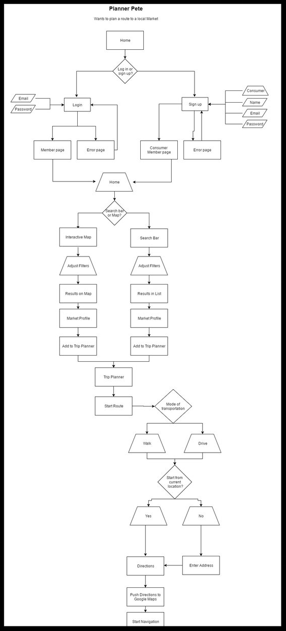
User Flows & App Map
Once I identified the users I mapped out the experience they would have by navigating through the app. I focused on both target audiences (farmers & consumers) and mapped out three main paths:
Make a shopping list & planning a route
Farmers on-boarding & posting a new product listing
Signing up for a CSA subscription
Site Map


User Flows


Wireframes
Once I understood more about the experience I was designing and who I was designing it for, I could start sketching out how the app would look and how it would function. After a a few iterations, my idea started coming together.
Up until this point I was open to the idea of this being a website but I decided this was going to be developed as a mobile app because of the following:
Shopping list in your pocket
Offline access is needed for locations & shopping lists
GPS is needed for directions to farms & markets


Prototype
With wireframes and feedback gathered, I took to Adobe Experience Design (Beta) & began hooking everything up to make it something that people could click through to get a feel for how the app would work. Rapid prototyping at this stage is a lot of fun because you can easily identify problems and confusion with your interface, make an adjustment and test it again and again until it works.
As a consumer please complete tasks in this order:
Log in or sign up
Search for a CSA
Subscribe to the CSA (add to cart and buy it)
Search for a Market
Get directions to the Market
Return to search/map page
Go to your shopping List
Make a new shopping list
Refresh the page to start the next section
As a farmer please complete tasks in this order:
Open your shop
Process the new order for carrots.
How did it go?
Send me some feedback! I want to know if there was anything missing or confusing for you.
Style Guide
The Final Product
This project was a really exciting and interesting experience for me. I learned a lot about working with two target audiences and the challenges that come with it. Different target audiences need very different things and it's definitely challenging trying to cram it all into one app.
After testing and iterating a few times, I was able to establish a familiar menu system. I concentrated on keeping the most important and most used menu items within thumbs reach to make navigating through the app comfortable and easy.

"It's a really good idea! I always want to check out farmers’ markets but I never know when they are on and where they are."
- Consumer
I had the opportunity to meet some fellow farmers market lovers and I learned a lot from farmers about their challenges with technology and sales. I found this very interesting.

"I manually scrape a google doc and individually email all those people. That is super time consuming!"
- Farmer
I plan on continuing to work on the app to improve it. I'd like to go through a few more iterations and user testing sessions with the prototype and then spend some time on the visual design to polish it up.
Here is what I plan to change based on the above prototype and user testing feedback I received:
Make directions appear when you select a farm or a market on the map
A better way of differentiating between consumer & farmer during onboarding (Right when you sign up it should say “What are you here for?” [I’m here to shop] or [I’m here to sell]
Change order status to drop down and colour code it (use a checkmark to accept orders and a status drop-down menu to update status)
Like what you see?
Check out more design projects I’ve worked on.
Want to work together ? Shoot me an email or connect with me on LinkedIn.